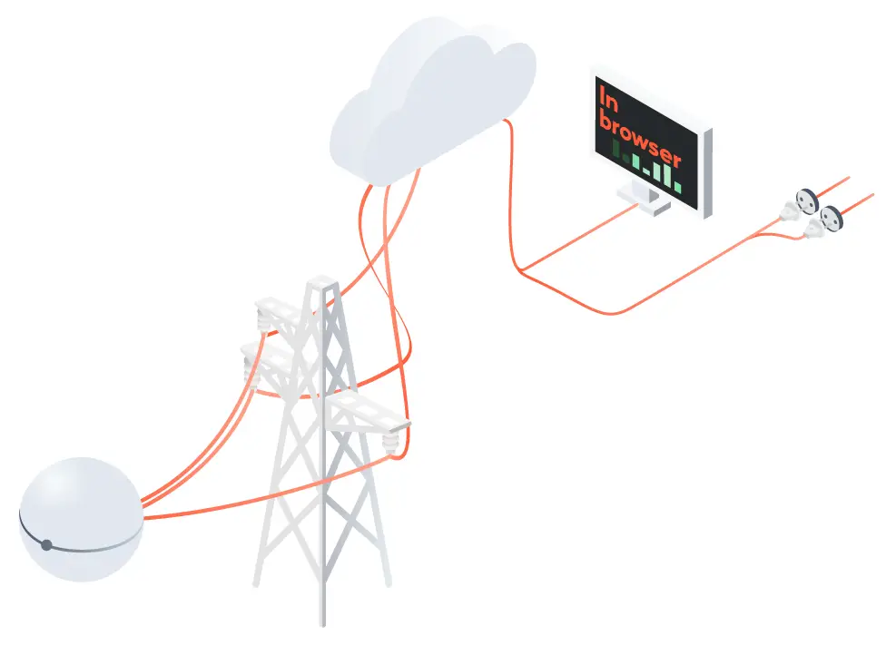
Optimizing power grids utilization using our
state-of-the-art software and unique hardware technology
Values
Integrity
We provide a complete solution for power grids optimization and earn confidence from our customers, suppliers, employees and stakeholders by focusing on safety and information security.
Innovation
We pursue new ideas and solutions, are courageous on shaping the future and continuously improve our technology and services.
Sustainability
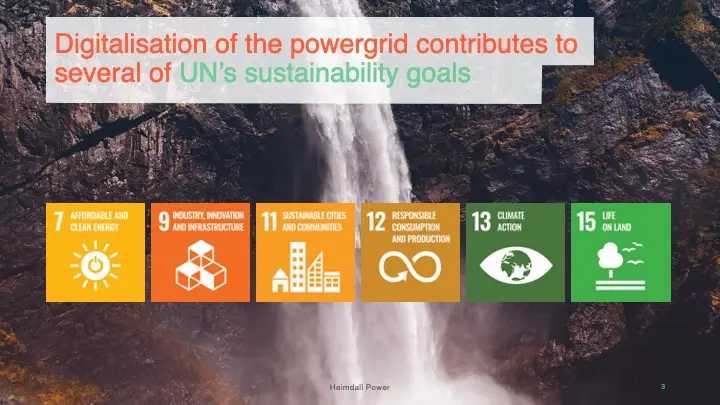
We are committed to the Green Shift and contribute to 6 of UN’s Sustainability Goals by having a sustainable mindset in our business practices.
Collaboration
We believe in the power of teamwork and support collaboration across teams, departments and organizations. Be kind and do good.
Tone of voice
Sustainability equals profitability. The selling points should be easy to put forward. When a brand is smart and innovative, it doesn’t have to prove itself by trying to sound complex and professional. Speak easy, and people will listen.
The industry is complicated and its language is packed with jargon. Since Heimdall Power needs to address complex issues within a narrow field, to potential clients and partners from many different cultures, just be simple and straight forward. Use short words whenever possible. Short sentences. No jargon when it’s not necessary.
We use a checklist to edit our written communication
• Always keep the reader in mind. And keep in mind what you want the reader to learn, feel, do — other than reading the text.
• Always use the full company name, Heimdall Power.
• Never use foreign phrases, a scientific word or a jargon if you can think of an everyday English equivalent.
• Never use a long word where a short one will do.
• If it is possible to cut out a word, always cut it out.
• Never use passive verbs where you can use the active.
• Avoid abbreviations.
Heimdall Power
Logo
In norse viking mythology Heimdall guarded Asgard. He could hear grass grow, he could see everything, he was the perfect watchman with the greatest integrity.
The icon is a stylized viking where you can find our neuron, radiowaves, electromagnetic waves, a high voltage mast, the millennium man … and a block chin. Together it reflect our brand’s mission — ‘To optimize power grids utilization’ — and how we bring it all to you.
The full color logos should only be used on very light or very dark backgrounds.
Don’t use the full color logo on top of a photograph or gradient unless it sits on a very light or very dark area of the image.
Heimdall Power
Colors
To match the bright, bold feeling, the color scheme is inspired by everything nature has to offer.
The palette is build around a bold lead color, warm orange, which represents the energy and integrity of the brand.
The greens symbolizes growth and renewal, being the color of spring and rebirth.
A simpler flat style is used for info-graphics. Allowing complex issues to be explained. And allowing more info-graphics to be easily made. Stokes are slightly rounded.
The Heimdall Power brand photos are specifically taken and focus on sustainability and product in use.
They locate Heimdall Power in Norway, a country associated with quality, innovation, standard of living and integrity. They use the Norwegian landscape to communicated sustainable power sources, spectacular nature and living with nature.
Editorial photo
The Heimdall Power editorial photos portrays a growing company with the credibility of reaching the goals.
They portray our values and are positive.
Employee photos
Simple, positive and recognizable. One key light and fill, and white background.
PowerPoint is a tool to support your story. Keep presentations simple and to the point. Remember your audience. Create visual presentation and use presentation notes for additional text, figures, reminders etc.
FONTS To ensure consistensy on all devices please use the replacementsfonts, Helvetica and Times New Roman.
PICTURES/ILLUSTATIONS Use assets from the Heimdall Power image-bank
INFOGRAPHICS/DIAGRAMS Ensure to use Heimdall colours and take size contrast into account.
CONTENT Make it personal. Remember: what’s in it for them?
Have a clear goal in mind with your news — what do you want the reader to learn, feel, do?
The recipient shouldn’t have to do anything, particularly in regards to organizing meetings. The next step should be as easy as a ‘yes’ or ‘no’ answer.
STRATEGY Think about what time and day the person you’re emailing is likely to be checking through their inbox.
Plan ahead with follow-up newsletter on big cases and develop a framework for how many days you’ll wait between newsletter one, two, three, etc.
STYLE AND TONE Visually break up your copy so it’s easy to digest – use spacing, numbers and bulleted lists where you can.
Social media
Be friendly, honest and trustful. Create positive professional conversations.
HEADER IMAGE Please use an official brand photo, graphics or video as the header.
ICON The icon can have different colour combinations.
TIPS FOR CREATING CONTENT
Be relevant Make the message relevant for the users. Think what is in it for me (the customer) and what will it take to share and like.
Compelling visual Compelling visual is crucial for the user experience. Use video, images and/or animations.
Clear call to action What do you want to achieve with your post? Boost brand engagement, drive traffic to heimdallpower.com or generate new leads?